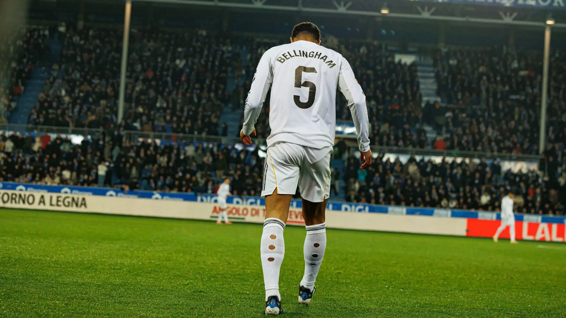
Look at the names and numbers on Boca Juniors’ 2026–27 adidas shirt. Their angular shapes echo the CABJ lettering inside an older club badge, bringing a detail from Boca’s past onto the players’ backs.
Nuestra bandera en el pecho 💙💛💙
— Boca Juniors (@BocaJrsOficial) August 4, 2026
Nueva camiseta titular de Boca, ya disponible
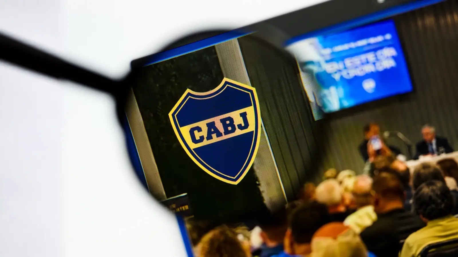
The connection is easiest to see side by side. In the historic crest, the four initials sit across a yellow band, with straight edges and diagonal cuts shaping the letters. The current shirt printing has a similar treatment: clipped corners, broad strokes and abrupt changes of direction.
It’s new lettering that echoes an old design, not a complete “font from 1932” brought back unchanged. The badge contains just four letters. A shirt font needs enough characters to spell every player’s surname, along with a full set of numbers.
The date comes from the version of Boca’s crest associated with 1932, when the club approved adding championship stars. It doesn’t establish when those letter shapes were first drawn or mean that an entire alphabet existed alongside them.
From four initials to a shirt font
Turning badge lettering into a usable font means working beyond what’s already there. The letters C, A, B and J offer clues about angles, proportions and corners. Other characters have to feel related without being copies of those four initials.
The numbers present an even clearer challenge. There are no digits in CABJ to reproduce. Their shapes have to carry the same character in a different form, large enough to dominate the back of a shirt rather than fit inside a small crest.
River Plate offers a documented example of that approach. For its 2022 identity project, design agency Grupo Berro developed a typeface from the arrangement of the CARP letters inside River’s badge, extending the design into an alphabet and numerals.
Una nueva identidad. Nuestra esencia de siempre. pic.twitter.com/9Up40EMQnQ
— River Plate (@RiverPlate) February 22, 2022
A heritage shirt doesn’t have to bring back an old collar or make an anniversary tribute the whole design. The connection to the past can sit in the shape of a letter.
The blue and yellow remain the most obvious identifiers. But the lettering gives the back of the shirt a connection to the badge on the front, even when that badge is out of view.
The name belongs to the player. The way it’s written can belong to Boca.
Get more Stadio United on Google.