Inter Milan’s 2026/27 away kit starts with a familiar baseball formula: a white base, narrow blue pinstripes and a dark contrast collar. The shirt’s defining change sits on the left chest. In place of the traditional circular badge is an enlarged I M monogram, applied in twill. Inter says no previous official match shirt has used its crest this way.
Inter has previously used an away shirt to reference another sport. A special-edition Nike away kit honored Valentino Rossi in 2025, carrying the motorcycle racer’s colors and number 46. This time, the intervention reaches deeper. The club isn’t building a tribute around its badge. It is changing the badge’s structure.
The design traces back to Giorgio Muggiani’s original crest from 1908. Muggiani, one of Inter’s founders, layered the club’s four initials, F, C, I and M, over gold and surrounded them with paired black-and-blue rings. The letters stood for Foot-Ball Club Internazionale Milano. Although Inter later experimented with square and shield-shaped emblems, it repeatedly returned to Muggiani’s circular framework.
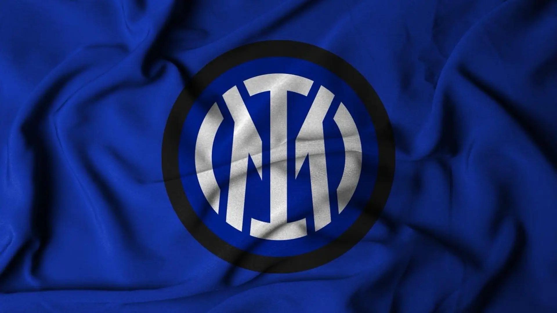
In 2021, Bureau Borsche recast the badge around just two letters, the I of Internazionale and the M of Milano. Inter also read I M as the English expression “I am,” but the initials stayed inside concentric circles. The update narrowed Muggiani’s design without removing its frame.
The 2026/27 shirt removes that container. The letters enlarge and overlap across the chest like a baseball team mark, while the twill gives them a raised, fabric-based finish. By contrast, the Inter Milan 2018/19 home kit worked within the club’s familiar black-and-blue stripe system. This shirt makes the emblem itself the experiment.
How the I M moved beyond the circle
The baseball references are selective rather than literal. The shirt retains the cut and function of a football jersey, then borrows vertical pinstripes, a contrasting collar, an oversized letter mark and a twill chest application. Nike’s elite version also uses Aero-FIT, a cooling construction that Inter says moves more than twice as much air as earlier Nike athletic apparel.
New York belongs in the design story, not just the launch calendar. Inter unveiled the kit on July 16 at Fanatics Fest NYC, one day before it went on sale. The club also introduced an Express Collection with a jersey, jacket and cap, photographed in the city by Alessandro Simonetti. Inter identified New York as a market for its growth outside Italy.
The palette and interlocking chest mark recall the visual language of New York baseball. Still, the official launch material names baseball broadly and doesn’t present the shirt as a Yankees collaboration. Inter and Nike frame the project as a translation of a sport’s design language rather than a licensed crossover with a specific team.
Inter plans to carry the format into later seasons, using other sports as starting points for future away kits. The approach gives the club a recurring way to test new visual references while keeping each design tied to Inter’s identity.
The crest hasn’t disappeared so much as been edited down to its oldest surviving letters. On a football shirt shaped by baseball, the I and M no longer sit inside the club’s history. They carry it.