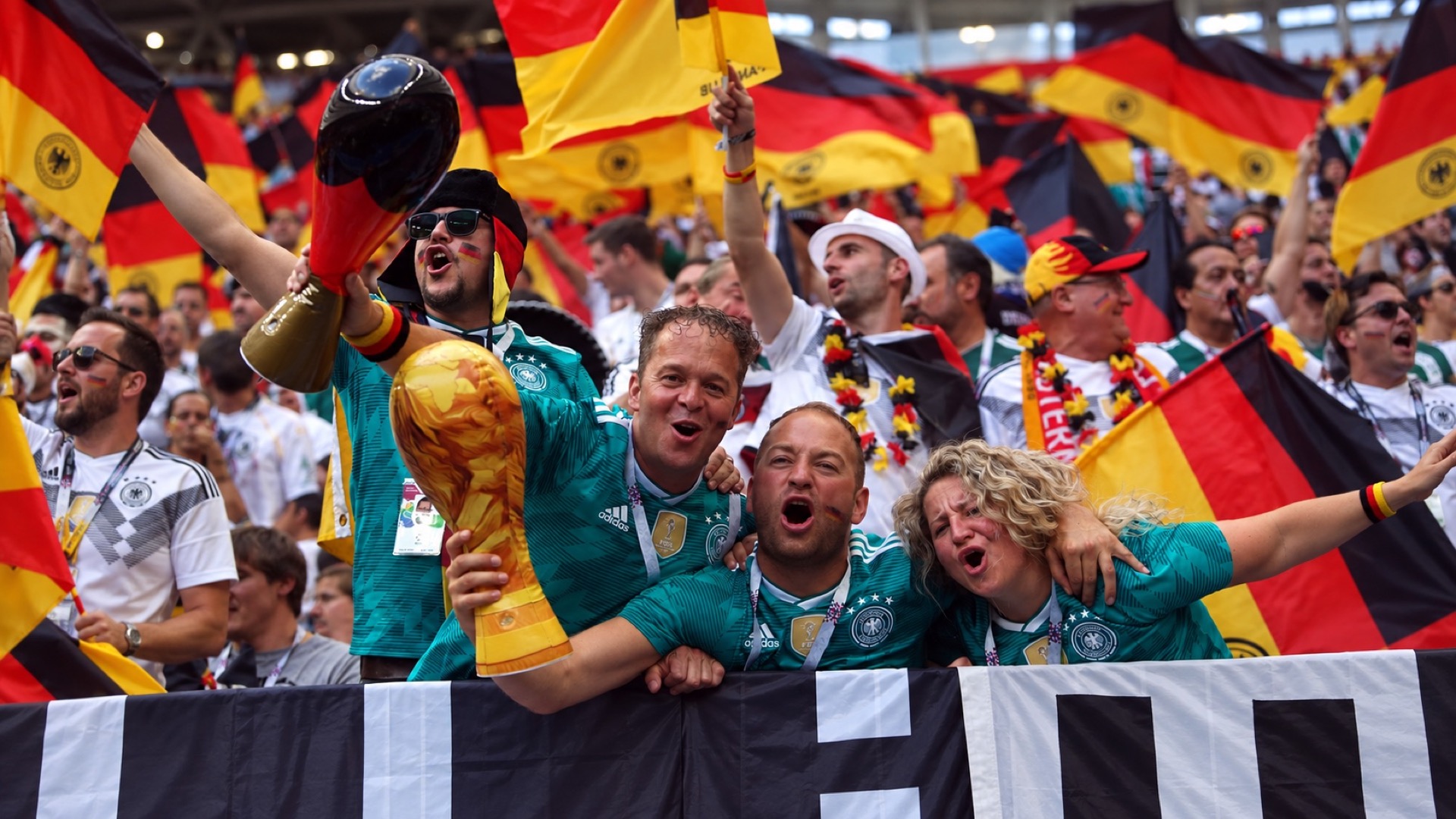
Germany’s 2018 green away shirt was designed to recall a World Cup semifinal victory. Adidas drew on the jersey West Germany wore against England at Italia ’90, bringing a successful team’s look into the defending champions’ wardrobe. Then the new shirt appeared in a group-stage elimination against South Korea.
Retro football kits invite two judgments at once. There’s the design, and there’s the football attached to it. Germany’s 2018 version puts them in direct conflict: an attractive tribute to a winning team, worn during a failed title defense.
The green-on-green pattern does most of the work, with white shoulder stripes and a narrow white collar providing contrast. You don’t need to remember the 1990 semifinal to appreciate the design. Its appeal shouldn’t depend on having watched the team that inspired it.
At the World Cup, Germany lost 2–0 to South Korea in Kazan. The defending champions were out. For anyone who’d admired the shirt at launch, the result posed an awkward question: had it become a worse design, or simply a harder thing to wear?
One appearance at Italia ’90
West Germany wore its green away shirt only once during the 1990 World Cup. That appearance was the semifinal against England in Turin, where Andreas Brehme’s goal and Gary Lineker’s equalizer left the teams level after 120 minutes. West Germany won the shootout 4–3. One match supplied the shirt with an entire tournament’s worth of drama.
Four days later, West Germany beat Argentina 1–0 in the final wearing white. Green wasn’t the color of the title-clinching performance. It belonged to the game that made the final possible, a narrower association but a particularly useful one for a future revival: England, penalties and a place in the World Cup final.
The color’s history stretches further back than either shirt. The familiar tale that Germany chose green to thank Ireland for being its first postwar opponent gets the chronology wrong. West Germany played Switzerland in November 1950. A connection to the DFB’s green insignia is plausible, although the original reason for choosing the color isn’t conclusively documented.
Adidas had already found another use for the 1990 design before the 2018 revival. Germany’s white kit for the 2017 Confederations Cup also drew on the old green away shirt. In its launch announcement, Adidas connected the earlier graphic with street and skateboarding culture. The pattern could survive a change of color and move from an away shirt to a home one.
That freedom extends beyond national teams. Dortmund’s Parma-inspired goalkeeper kit shows how an old design can be adapted for a different club. Borrowing the visual doesn’t require recreating the original circumstances. A recognizable pattern can be worth bringing back on its own terms.
Germany’s 2018 shirt deserves that same separation. Admiring its design doesn’t require defending the team’s performance. Nor does avoiding it after Kazan mean its colors or proportions are wrong. Someone choosing a shirt for its appearance and someone choosing it for a cherished match are buying different things, even when they pick up the same jersey.
The trouble with judging a retro shirt entirely by results is that its design gets credit for victories it didn’t cause and blame for defeats it couldn’t prevent. The 1990 reference was genuine. So was the 2018 disappointment. Neither settles whether the green shirt looks good.
You can love the shirt without wanting the match back.