Germany’s 1990 home shirt has a rival hanging beside it. The 1994 version takes the same white base and national colors, then sends them into a far more unruly arrangement of diamonds. One gets almost every proportion right. The other is harder to ignore. Choosing between them is more interesting than simply choosing a World Cup winner.
With Germany’s final Adidas shirt bringing the partnership back into focus, there’s a temptation to judge the entire wardrobe through nostalgia. But the best Germany home kits deserve a closer look at their collars, graphics and use of space. Across West Germany and the unified national team, the strongest period runs from 1988 to 1996. Its appeal isn’t that every shirt looks alike. It’s that they don’t.
1974: the benchmark for restraint
The earlier benchmark is 1974. White fabric, a black round neckline and dark cuffs give the shirt a directness that later designs sometimes lose. There’s no elaborate pattern competing with the crest. Crucially, the jersey worn by those World Cup winners was made by Erima, not Adidas. Its place near the top of this comparison rests on restraint: every dark detail has a purpose against the white.
Germany’s 1974 home kit
1990 versus 1994: the best Germany home kits
The shirt associated with Italia ’90 changed the scale of the decoration. Designed by Ina Franzmann and introduced for the 1988 European Championship, it carried black, red and gold in an angular band across the upper body. Calling it the 1990 shirt is convenient, but the idea was already two years old when West Germany became world champion.
That band gives the shirt its rhythm. The eye follows its changes of direction without getting lost in repeated shapes, while the white below keeps the whole thing from feeling crowded. It’s assertive without covering every available inch. The trophy adds to its story, but the composition would still work without a medal in the photograph.
Germany’s 1990 home kit
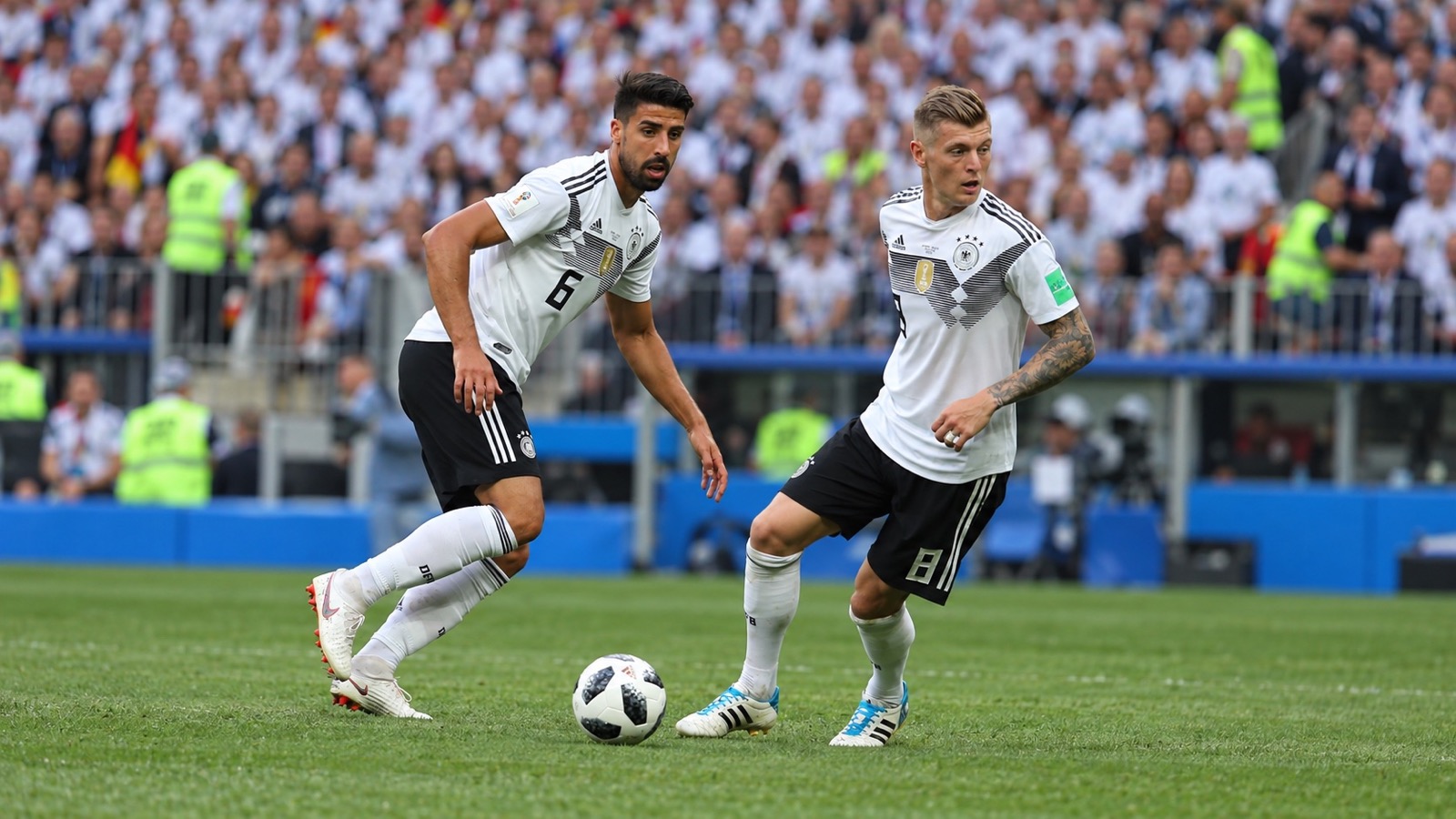
Germany’s 1994 home kit puts restraint under pressure. Black, red and gold diamonds spread across the shoulders, while the patterned collar adds another point of interest. Where the earlier shirt gives the eye a clear route, this one makes it jump between shapes. It’s a busier design, but the repetition holds it together. The attraction is precisely how far it pushes a familiar white jersey.
Germany’s 1994 home kit
There’s a persuasive case for putting it first. It has the greater appetite for risk, and its shoulder pattern offers something that a small chest graphic couldn’t. Yet the 1990 design makes its statement with fewer competing elements. That economy earns it the narrow win. The 1994 shirt is the better provocation; its predecessor is the better composition.
1996: the power of a black collar
Then comes 1996, which prevents the era from becoming a contest in ever-larger graphics. The black button-up collar provides the strongest contrast against a predominantly white body, giving the shirt a more composed appearance. It doesn’t need to repeat the diamonds to belong alongside them. After the color and movement of the previous designs, a well-judged collar is enough to change the mood.
Germany’s 1996 home kit
The modern challengers, from 2006 to 2018
The 2006 home shirt finds another route. Its curved red and gold side panels frame the torso instead of placing the main attraction across the chest. The center stays relatively open, with the color appearing around its edges. It’s a convincing modern alternative to the older horizontal patterns, although those sweeping curves make it feel more tied to its period.
Germany’s 2006 home kit
The 2010 shirt pulls back again. A dark crew neck and mostly white body favor smaller details over a dominant graphic. It’s the quieter choice, and an attractive one, but it doesn’t alter the balance of the leading contenders. Beside the 1988–1996 shirts, it feels more careful than adventurous.
For a modern challenger with a stronger claim, turn to 2014. The broad chest chevron, built from different shades of red, establishes a clear focal point without reproducing the older tricolor band. There’s enough white beneath it to preserve the contrast. It belongs in the top five because it finds a memorable shape of its own, not simply because Germany won another World Cup wearing it.
Germany’s 2014 home kit
The 2018 home shirt takes a different approach, reworking the 1990 graphic in monochrome. It’s an effective translation, but the comparison also exposes how much personality the original gets from its color. Unlike the debate around Germany’s 2018 green away shirt, the deciding question here isn’t what happened at the tournament. It’s whether a reinterpretation improves on the design it borrows. This one doesn’t quite do that.
2024 and 2026 revisit the shoulders
In 2024, the emphasis returns to the shoulders. Black, red and gold gradients, intended to evoke eagle wings, give the white shirt a distinctive frame. The 2026 home design looks further back: the DFB explicitly identifies 1994 as the reference for its zigzag treatment. Put those two shirts together and the older design still looks remarkably assured. The newer version is attractive, but it doesn’t displace its inspiration.
Germany’s 2024 home kit
Germany’s 2026 home kit
Our top five Germany home kits
Our order is 1990, 1994, 1974, 1996 and 2014. The winning era is 1988–1996, when Germany could move from a single striking band to an expansive diamond pattern and then back to a commanding black collar. For one shirt, take 1990. For the strongest argument against it, keep 1994 within reach.