Leyton Orient turned Wrexham’s new third shirt into a million-view badge argument by asking Ryan Reynolds and Rob Mac what they were “playing at.” The O’s attached a Roy Hodgson reaction clip after spotting a familiar arrangement on the shirt’s chest: two red, winged creatures facing one another over a football.
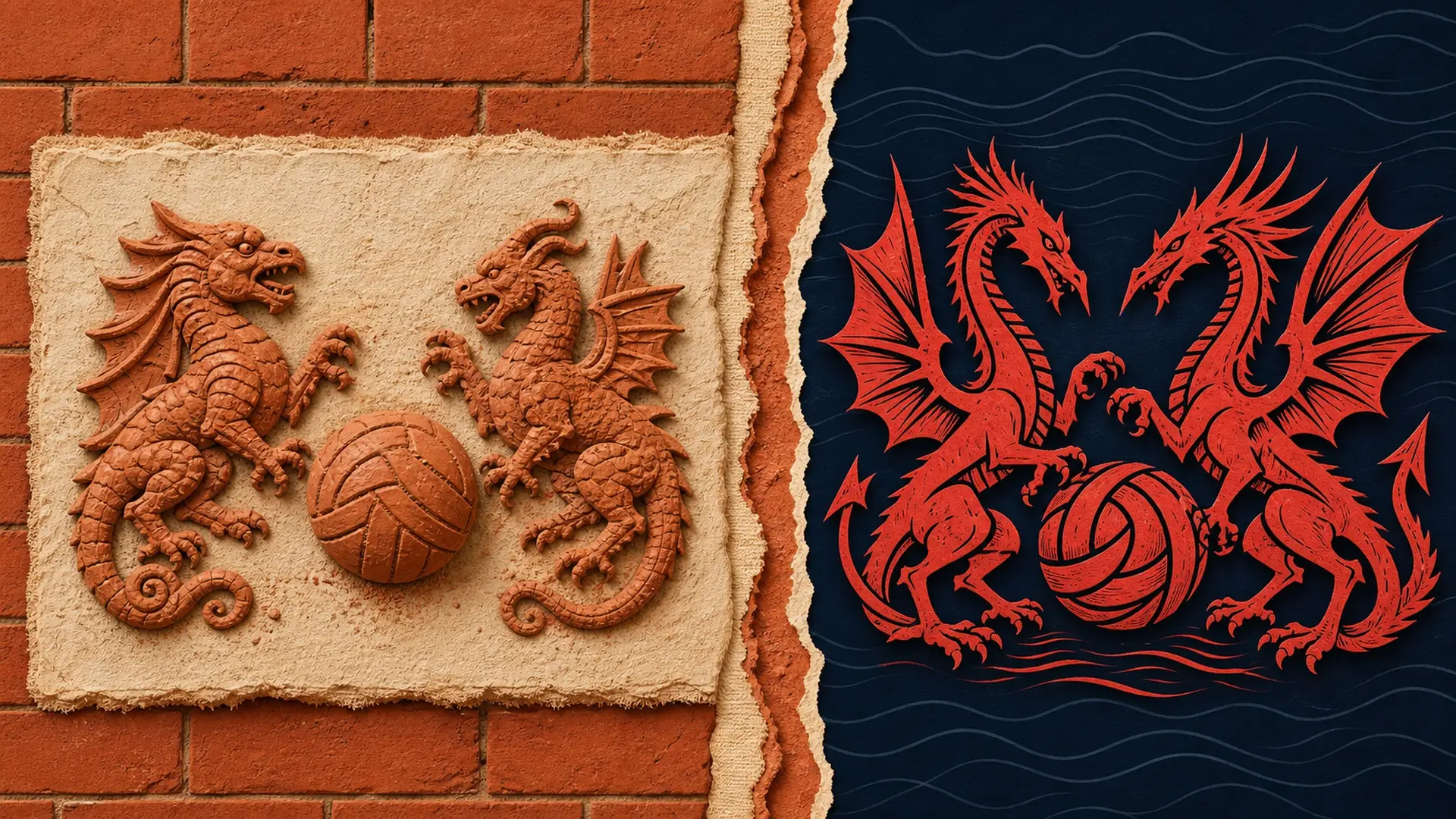
Wrexham calls the emblem a secondary mark, not a replacement for its traditional crest. It sits on the cream-and-black Terracottapolis third kit in terracotta orange. An embossed pattern drawn from Ruabon brickwork gives the shirt the same kind of local-landmark storytelling used on Borussia Dortmund’s 2026/27 home shirt, turning a regional industry and a planned stadium detail into something visible from the stands.
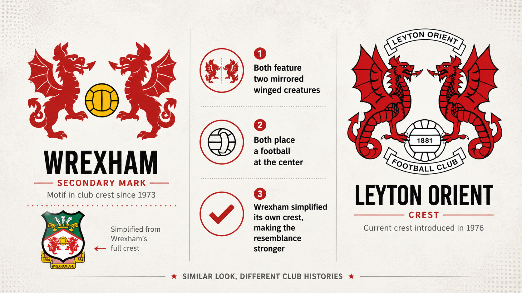
At phone-screen size, Orient’s joke lands immediately. Its crest also places two red, winged creatures in mirrored poses around a ball. The differences appear when the marks are enlarged. Wrexham’s figures are Welsh dragons, while Orient officially identifies its pair as wyverns, mythical creatures combining features of a dragon and a serpent.
The more revealing difference is chronology. Wrexham’s full badge has carried two dragons and a football since 1973, when the club adopted a design created through a local newspaper competition. Orient introduced the basis of its current twin-wyvern crest in 1976. The imagery behind Wrexham’s new symbol therefore predates Orient’s badge by three years.
That doesn’t make Orient’s callout meaningless. Wrexham’s traditional shield surrounds the dragons with the Prince of Wales feathers, Welsh colors, banners and the club’s founding year. Remove those features and almost the same visual skeleton that has defined Orient for five decades remains: two symmetrical creatures, one football and little else.
How simplification created the collision
Wrexham’s version begins in Wales. The dragons already occupy the center of its full crest, while the terracotta color carries the new mark into Ruabon’s industrial history. The village near the Racecourse Ground became known for brick, tiles and decorative clay products, earning the nickname Terracottapolis. Wrexham has extended that language into the planned Kop stand, whose Ruabon-red facade includes dragons taken from the club crest.
Orient’s wyverns follow another route. Club histories connect them to the City of London, the Thames and the sea, along with the Orient Shipping Company that helped shape the club’s name. Two similar fantasy creatures are doing different cultural work: one pair points toward Wales, the other toward London and a maritime past.
Compact marks are now expected to work on shirts, apps, retail tags and small digital avatars. Stadio examined the same pressure around Atalanta’s possible logo change, where simplifying a familiar image raised questions about what a club could remove without weakening recognition. Wrexham’s mark still reads as Wrexham, but stripping away its surrounding context makes it look far closer to Orient.
Neither club has announced a trademark complaint, cease-and-desist demand or legal action. Orient’s public response remains a pointed social-media joke, not a formal accusation of infringement. Calling Wrexham’s design plagiarism would overstate the available facts and ignore the earlier history of its dragons-and-football motif.
Wrexham didn’t need to borrow Orient’s history to create this badge. It simplified its own. In doing so, it entered a shape that Leyton Orient has spent half a century making unmistakably its own.