VfL Wolfsburg’s new crest does not begin with the wolf. It begins with a wall.
The club announced on May 9, 2026, that it would switch its logo with immediate effect, beginning the transition with its match against Bayern Munich. It is a return after 24 years under the outgoing modern mark, but the timing does not make the decision feel sudden. The rollout stretches from digital identity to stadium signage and, eventually, the match kit.
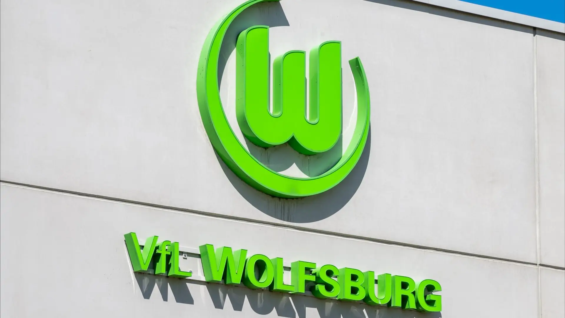
The returned mark is spare: a green W, three squared tops, a circular frame. The geometry is simple enough for the phone screen. Its meaning is older than the screen. Those three squared tops are not decorative notches. They are battlements.
Wolfsburg Castle is the namesake and landmark of the city. It was built more than seven centuries ago by the von Bartensleben family, then converted around 1600 into a North German Renaissance palace. In a club badge, the castle does not need to be drawn in full. The wall line is enough.
Modern Wolfsburg belongs equally to a different story. The city took shape around the Volkswagen factory, begun in 1938 as a residential town for workers. After the war, the city council gave it the name Wolfsburg on May 25, 1945, in reference to the castle on the Aller River. The new crest pulls those histories closer together: the industrial city and the older landmark that named it.
A badge built from the city’s older name
Recent football branding often treats badges as assets to be flattened, scaled and used across retail systems. Wolfsburg’s choice is cleaner than the outgoing logo, but it does not retreat into anonymity. The modernized battlement crest provides a reference point for simplification.
The official process was also unusually formal. VfL said the decision followed months of work involving VfL Wolfsburg-Fußball GmbH, VfL Wolfsburg e.V., the supervisory board, representatives of the fan scene and the city, with support from ATELIER SASSERATH x MUTABOR. Sebastian Rudolph, chairman of the club’s supervisory board, framed the design in institutional terms: “The battlements create a sense of identity and embody tradition.”
Supporter representative Marvin Minner put a longer timeline on the return: “We have been campaigning for the return of the battlements for over 20 years.” That line matters because it keeps the redesign from reading as a seasonal brand refresh. The badge is being presented as a restoration, not a detached graphic exercise.
The production side gives the story a practical wrinkle. Standard 2026/27 playing kits will still carry the outgoing logo because kit production lead times run nearly two years. Nike and Wolfsburg plan a special kit with the battlement crest for the coming season, while regular official playing kits move to the crest from 2027/28. The new crest therefore exists first as an institutional decision, then as a product system.
A football badge is part of a club’s identity before it is a graphic system. Wolfsburg’s switch works because the W is not being asked to look timeless by becoming generic. It is being asked to carry a specific place. A castle gave the city its name. The club has put that name back into the shape of the letter.